Breadbox is a cloud storage application that helps users organize their personal recipe collections and store them in a single, safe digital environment. With Breadbox, users can save recipes from multiple sources, share recipe files with family and friends, and use their recipe collection to create meal plans.
Design a new cloud-storage product that could succeed in a saturated market
UX Design, Branding, Visual Design
Sketches, Wireframes, Logo, Style Guide, High-Fidelity Mockups, Interactive Prototype
Figma, Sketch, InVision, UsabilityHub
The cloud storage market is already home to well-known products like Google Drive, Dropbox, and Box. Can a new product succeed with the right combination of features to meet the needs of a particular audience? With this question in mind, I decided to focus this project on a specific market segment: recipe storage and management products.
These days most of our documents, calendars, and photos are stored digitally. But recipes are often still stored as physical documents in cookbooks, on scraps of paper, or note cards. With the rise of recipe blogs and websites, and the enduring popularity of cookbooks, it can be easy to forget exactly where you found that great banana bread recipe. Users lack a digital platform where recipes from many different sources can be stored.

In order to succeed in the already saturated cloud storage market, a new product needs to target a specific segment of the market. Breadbox does this and solves the problem of scattered and disorganized recipe storage by providing one centralized, digital storage solution for users’ entire recipe collections, no matter where their recipes are currently stored.
With Breadbox, users can upload recipes manually, snap and save a photo of their recipes, or save links to their favorite recipe sites. Users can easily share their recipes with family and friends or create a meal plan using the recipes saved in their collection. Breadbox users will spend less time searching for recipes and have more time to spend enjoying their meals.
To better understand the recipe management and cloud storage market, I conducted a competitive analysis of three existing products: Yummly, BigOven, and Pinterest. All three offer users the ability to save and organize recipes, though they differ in a few significant ways.

Having a clear focus on saving and managing content while incorporating new features that enable collaboration in the kitchen would set a new competitor apart from existing products on the market.
With a better understanding of existing recipe management products, I conducted a survey of potential users to gain a better understanding of their cooking habits and recipe management strategies.


The bulk of respondents who use recipes currently store them in a notebook or binder (50%) or in cookbooks (52%). Just 22% currently use a digital storage solution such as browser bookmarks or a recipe management app.
Initially, I was unsure about whether the MVP should be designed as a responsive website or a mobile app. The user survey revealed that nearly 50% of potential users didn’t have a strong preference, and 65% reported viewing recipes on a computer more often than a phone. With this data in mind, I determined that Breadbox would be most useful as a web app.
The information gained from the survey about users’ habits and experiences with existing products informed the creation of three personas that are representative of potential users’ goals and frustrations with recipe management.

Based on the information learned from the research I conducted, I wrote out user stories that represented the features that users would like to have in a recipe management app.
I prioritized the stories based on what I had learned in the user survey, and came up with high priority stories that represented the core features of the project’s minimum viable product.
As a user, I want to...
• create a new account
• manually add recipes
• upload photos or documents of recipes
• save new recipes I find on the internet
• create a meal plan
• share a meal plan with someone else
• organize my recipes in collections or groups
Next, I sketched user flows to represent all of the high priority user stories and a few of the medium priority stories as well.

I began wireframing by sketching out screens that represented all of the user flows. Most screens had a few different iterations in the initial sketches in order to visualize different layouts and placements for the meal plan preview and the main navigation bar.


I conducted three usability tests of three essential flows:
1. Creating a new account
2. Adding a recipe
3. Adding a saved recipe to the meal plan
All three participants were able to complete the tested tasks. Even so, these usability tests provided useful feedback about aspects of the design that would require more clarity moving forward.

1. The meal plan cards - the icon placeholders for breakfast, lunch, and dinner were confusing to multiple testers.
2. The ‘Settings’ menu - moving it from the lower left hand corner to the upper right might feel more familiar to users.
3. The add button in the empty state copy - testers thought it would be clickable, but it wasn’t.

With a structure for the MVP in place, I focused on creating a brand for the product. I decided to call it Breadbox since a breadbox is a common kitchen item that is used for food storage. Since the product is focused on recipe storage and meant to be used in the kitchen, it seemed fitting. ‘Box’ also brings to mind existing cloud storage products.
The Breadbox brand is personal, fresh, and fun and conveys feelings of trust, ease, and reliability. Survey results indicated that users are interested in a straightforward product that doesn’t have too many bells and whistles, so this desire for ease and simplicity is reflected in the branding.


The primary brand colors are green and orange, colors that naturally bring to mind food items like leafy greens, carrots, oranges, and avocados.

The font families used, Aleo and Cabin, are clean and approachable. Cabin is a sleek sans serif typeface used for the body text that works well with Breadbox’s text-heavy recipe content because it is very legible.
Headline Text
Aleo regular
ABCDEFGHIJKLMNOPQRSTUVWXYZ
abcdefghijklmnopqrstuvwxyz
1234567890
Aleo bold
ABCDEFGHIJKLMNOPQRSTUVWXYZ
abcdefghijklmnopqrstuvwxyz
1234567890
Body Text
Cabin regular
ABCDEFGHIJKLMNOPQRSTUVWXYZ
abcdefghijklmnopqrstuvwxyz
1234567890
Cabin bold
ABCDEFGHIJKLMNOPQRSTUVWXYZ
abcdefghijklmnopqrstuvwxyz
1234567890
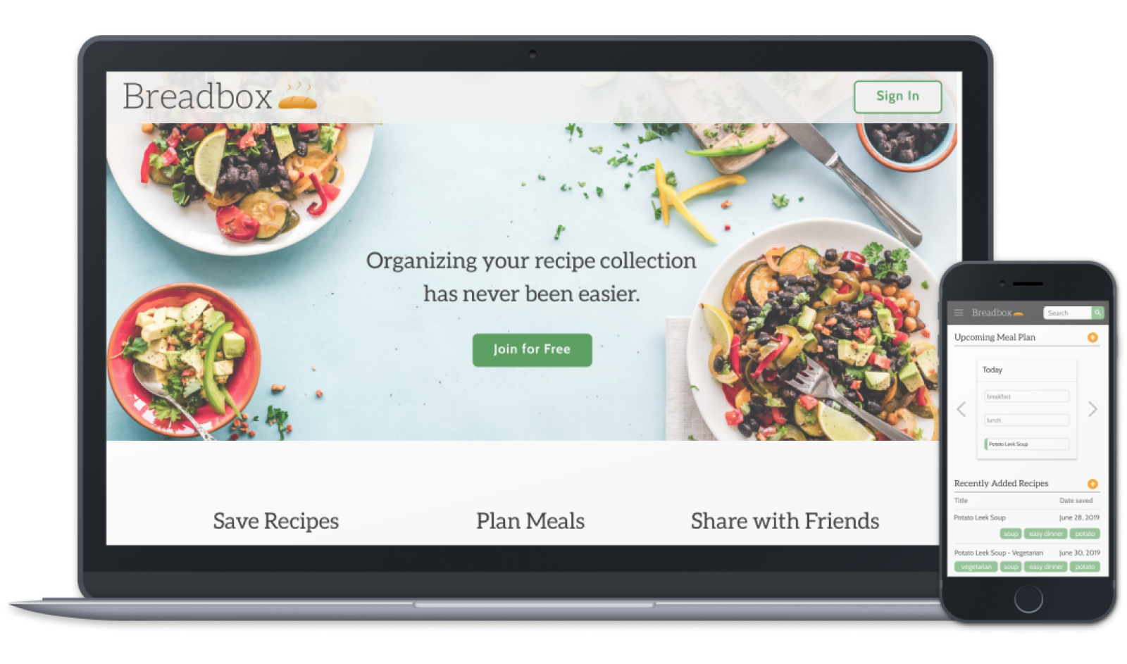
With a product name and clearly defined direction for the brand in place, I created high-fidelity mockups that took into account my findings from the initial round of usability testing.


I conducted three preference tests using UsabilityHub on different elements of the visual design where I had considered multiple options. I conducted a test with the following four images in order to help determine the best hero image for the landing page.


A majority of testers preferred the fourth image. Some users reported that the images with hands kneading and rolling dough reminded them made them think of the work involved in cooking rather than the joy of preparing and sharing a meal. Based on this feedback, I updated the hero on the landing page.
Based on feedback gained from a second round of usability testing and the three preference tests, I created a final prototype of the design.

Breadbox was the first end-to-end design project that I worked on. It was an exciting challenge and I learned a lot throughout the entire project. The process of designing Breadbox emphasized the importance of building upon on a solid foundation of research. During the later stages of this project, I often went back to my notes from the user survey and the user personas to make sure that I was keeping the users at the forefront and not veering off course.
In future iterations of this project, I would like to continue to add features to Breadbox that users expressed a desire for that fell outside the scope of the MVP. This could include the ability to create grocery lists in the app, and designing a more robust recipe detail view that would include additional information like personal recipe notes and photographs.